Elizabeth Haidle
It's interesting to return so often to the topic of 7R, while life continues to whirl around us and the music of that project lies still 7 months ahead. It's fun, because it continues to spark my imagination, solidifying or modifying ideas. Ideas are The Crossing's friend; we like to treat ideas like little pebbles - we pick them up and play with them, view them from different angles, in different lights, hit one against the other to see what they sound like and how they bounce off each other, throw them into a brook and listen to them gurgle and sigh.
And so it is with Elizabeth Haidle and her artwork. I've known Elizabeth a long time now, and I've watched her take my ideas and make them her own, tossing them around, throwing them back and forth until she finds just the right feel, the perfect texture, the color that says something no other color would in this specific situation - making a minor adjustment to a shadow or crease that makes all the difference, creating worlds within worlds. Her drawing abilities are equal to her extraordinary imagination - she sees possibilities in the physical world most miss, and she doesn't have a preconceived idea of how anything ought to be, allowing an idea to grow organically into what it wants to be. We love that. So, when we imagined 7R, I knew it was Elizabeth who had to create the feel, through graphics and a logo, of what we are trying to say - what the concerts will feel like, what potential lies in the idea.
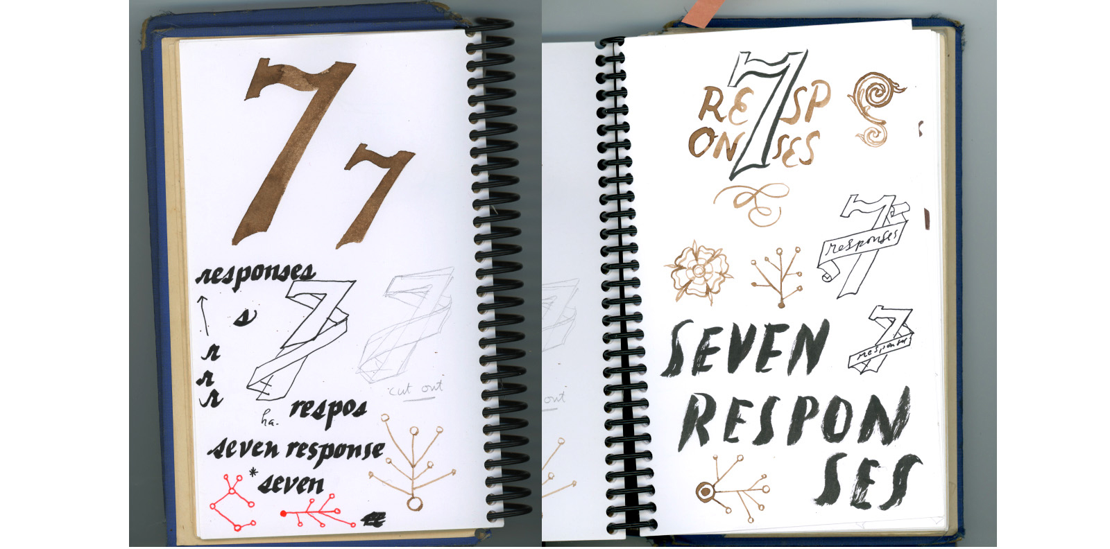
For this blog entry, we asked Elizabeth to talk a little about her concept and how it developed. She shared the sketch book she used while developing the striking logo that features the 7 limbs of Jesus, each of which is addressed in one of Buxtehude's cantatas that comprise Membra Jesu Nostri.
We began here:
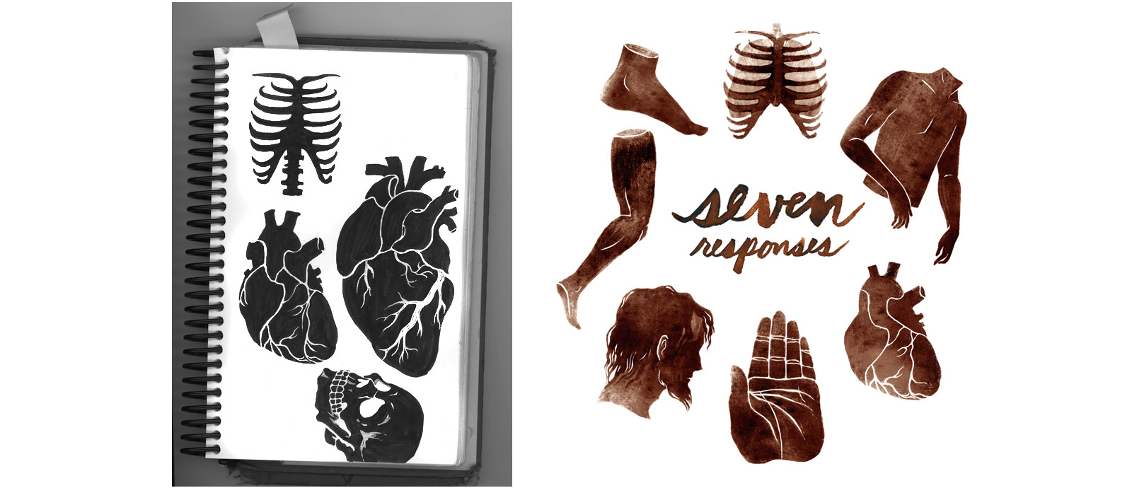
Then, we had a number of conversations about the use of the number 7 and the thorned circle.
Elizabeth tells the whole story:
"I thought about the theme of suffering, which parallels human life as a seeming necessity. And yet suffering can become something beautiful when the darkest experiences yield a deep capacity for compassion. Pages of explorations in the sketchbook ensued: early ideas involved the seven responses as a connecting of disparate parts...from branches with limbs, to threads weaving a knot. Later, I was inspired by the mobius strip, and created one based on the number 7 - a looping and repeating surface, bent into planes and angles. The idea of contrast, of bittersweet, brought to mind the thorny rose. Following the thread of a plant-based metaphor...I realized the crown of thorns would convey this contrast best: of love and suffering combined. The vines, woven, created a border to hold the project's title; the spot illustrations followed naturally, as Donald explained each of the movements' sub-themes. The circular composition references the wheel of life, turning endlessly with themes that are universal to humanity, on repeat."
And Elizabeth added:
"On a personal note, I am very honored to be included as a collaborator on this project! I hope that the imagery serves to add nuances to the complexity already inherent in this project, the inspirations behind it, and the conversations and connections which will ensue."
We love the final graphic so much, it became the homepage of this microsite, inviting visitors to click on one of the limbs to find out about the artist who is composing the musical response to that limb. And, without the limbs, the logo invites us into an experience that may be rough, organic, questioning, and beautiful.


